Sample audit.

Overview

I was provided with the HTML code for a fictional Modern Art Department webpage and asked to remediate it for accessibility. I conducted a full WCAG using WAVE and ChatGPT to identify accessibility barriers and opportunities for improvement. Select the link below to download the original HTML file. Refer back to it as you read the audit results.

Results

Issue 1: Page title is vague.

  • Problem: The <title> element says “The Art”, which is too vague and does not clearly describe the page’s purpose.
  • WCAG: 2.4.2 Page Titled (Level A) — Web pages have titles that describe topic or purpose.
  • Fix: Update the <title> element to clearly describe the content, e.g. “Modern Art Department — Home.”
  • Simple Explanation: “If the text color doesn’t stand out from the background, students with low vision may not be able to read it at all.”
  • Code before:
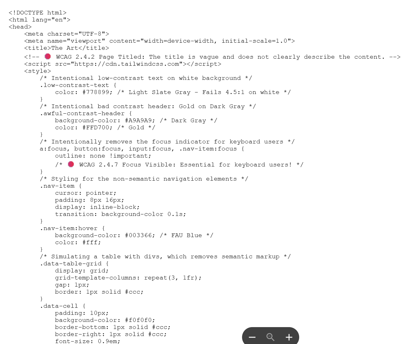
    <title>The Art</title>
        
  • Code after (example):
    <title>Modern Art Department — Home</title>
        

Issue 2: Missing main heading (H1).

  • Problem: The main page title is styled with a <span> instead of a semantic <h1>.
  • WCAG: 1.3.1 Info and Relationships (Level A) — headings must convey structure.
  • Fix: Change <span> to <h1>.
  • Simple Explanation: "Headings allow students using screen-readers to skip around to explore what's on the page. Without a clear main heading, they can't quickly understand what the page is about."
  • Code before:
    <span class="text-4xl ...">Modern Art Department</span>
        
  • Code after (example):
    <h1 class="text-4xl ...">Modern Art Department</h1>
        

Issue 3: Header text fails contrast.

  • Problem: Gold text #FFD700 on dark gray #A9A9A9 has poor contrast.
  • WCAG: 1.4.3 Contrast Minimum (Level AA).
  • Fix: Use high-contrast pair, e.g. dark background + white text.
  • Simple Explanation: “If the text color doesn’t stand out from the background, students with low vision may not be able to read it at all.”
  • Code before:
    .awful-contrast-header { background:#A9A9A9; color:#FFD700; }
        
  • Code after (example):
    .header-accessible { background:#111827; color:#FFFFFF; }
        

Issue 4: Body copy is low contrast.

  • Problem: .low-contrast-text { color:#778899; } on white fails 4.5:1 ratio.
  • WCAG: 1.4.3 Contrast Minimum (Level AA).
  • Fix: Use a darker text color like #1f2937.
  • Simple Explanation: “When regular text is too faint, it strains the eyes and makes it hard for students with vision impairments to read comfortably.”
  • Code before:
    .low-contrast-text { color:#778899; }
        
  • Code after (example):
    .body-text { color:#1f2937; }
        

Issue 5: Focus indicators removed.

  • Problem: CSS removes outlines for focus states, hiding keyboard focus.
  • WCAG: 2.4.7 Focus Visible (Level AA).
  • Fix: Provide clear focus outlines.
  • Simple Explanation: Focus indicators allow student's who can't use the mouse the ability to jump around the page with a keyboard button (usually tab). If you turn this feature off, a student who can't use a mouse won't know where they are on the page.
  • Code before:
    a:focus, button:focus, input:focus { outline:none !important; }
        
  • Code after (example):
    :focus-visible { outline:3px solid #FFD700; outline-offset:2px; }
        

Issue 6: Skip link implementation.

  • Problem: Skip link is always visible and relies on JS instead of anchor behavior.
  • WCAG: 2.4.1 Bypass Blocks (Level A) — A mechanism is available to bypass blocks of content that are repeated on multiple Web pages.
  • Fix: Hide skip link visually until focused, use standard anchor to #main-content.
  • Simple Explanation: "Skip links let students who use a keyboard or screen reader jump past long menus and go straight to the main content. If they’re always visible or not set up properly, it can be distracting for some users and confusing for others, making navigation harder instead of easier."
  • Code before:
    <a href="#main-content" class="absolute ...">Skip to main content</a>
        
  • Code after (example):
    <a class="skip-link" href="#main-content">Skip to main content</a>
        

Issue 7: Non-semantic navigation.

  • Problem: Nav built with <div> and onclick, so it is not keyboard accessible.
  • WCAG: 2.1.1 Keyboard (Level A) — All functionality of the content is operable through a keyboard interface without requiring specific timings for individual keystrokes; 1.3.1 Info and Relationships (Level A) — Information, structure, and relationships conveyed through presentation can be programmatically determined or are available in text.
  • Fix: Use <nav><ul><li><a href>>.
  • Simple Explanation: “If menus are built in a way screen readers can’t recognize, students with sight difficulties may not even know the navigation exists.”
  • Code before:
    <div class="nav-item" onclick="goTo('home')">Home Page</div>
        
  • Code after (example):
    <nav><ul><li><a href="/home">Home</a></li></ul></nav>
        

Issue 8: Vague image alt text (Discuss)

  • Problem: The image's alt. text provides no meaning.
  • WCAG: 1.1.1. Non-text Content (Level A) — All non-text content that is presented to the user has a text alternative that serves the equivalent purpose.
  • Fix: Provide descriptive alt. text.
  • Simple Explanation: “If an image is only labeled as ‘Image,’ a student with sight difficulties has no idea what it shows or why it’s important.”
  • Code before:
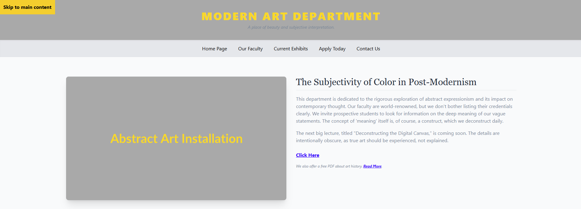
    <img ... alt="Image">
        
  • Code after (example):
    <img ... alt="grey block with yellow text says 'abstract art installation,' potentially a piece of art itself."
        

Issue 9: Heading hierarchy skipped.

  • Problem: First subsection uses <h3> instead of <h2>.
  • WCAG: 1.3.1 Info and Relationships (Level A) — Information, structure, and relationships conveyed through presentation can be programmatically determined or are available in text.
  • Fix: Use <h2> to maintain proper outline.
  • Simple Explanation: “When heading levels are skipped, students using screen readers lose the logical flow of the page and may get lost. Headings also make your page better organized and scannable for students who do not rely on screen readers."
  • Code before:
    <h3>The Subjectivity of Color in Post-Modernism</h3>
        
  • Code after (example):
    <h2>The Subjectivity of Color in Post-Modernism</h2>
        

Issue 10: Vague link text.

  • Problem: Links like “Click Here” and “Read More” are ambiguous.
  • WCAG: 2.4.4 Link Purpose (In Context) (Level A) — The purpose of each link can be determined from the link text alone or from the link text together with its programmatically determined link context.
  • Fix: Use descriptive links.
  • Simple Explanation: “If a link just says ‘Click here,’ a student with sight difficulties can’t tell where it will take them without guessing.”
  • Code before:
    <a href="#">Click Here</a>
        
  • Code after (example):
    <a href="/lecture">Learn more about ‘Deconstructing the Digital Canvas’</a>
        

Issue 11: Non-semantic table.

  • Problem: Thesis schedule uses <div> grid instead of <table>.
  • WCAG: 1.3.1 Info and Relationships (Level A) — Information, structure, and relationships conveyed through presentation can be programmatically determined or are available in text.
  • Fix: Use <table> with headers and caption.
  • Simple Explanation: “If a schedule is built without proper table code, screen readers can’t tell which names match which dates or titles.”
  • Code before:
    <div class="data-table-grid">...</div>
        
  • Code after (example):
    <table><thead><tr><th>...</th></tr></thead><tbody>...</tbody></table>
        

Issue 12: Link used as submit button.

  • Problem: <a href="#"> used to submit form instead of <button>.
  • WCAG: 2.1.1 Keyboard (Level A) — All functionality of the content is operable through a keyboard interface without requiring specific timings for individual keystrokes; 4.1.2 Name, Role, Value (Level A) — For all user interface components… name and role can be programmatically determined.
  • Fix: Use <button type="submit">.
  • Simple Explanation: “If a form uses a link instead of a real button, keyboard and screen reader users may not be able to submit it at all.”
  • Code before:
    <a href="#" onclick="submitForm()">Sign Up Now!</a>
        
  • Code after (example):
    <button type="submit">Submit RSVP</button>
        

Issue 13: Footer text too small and low contrast.

  • Problem: Footer text is .text-xs and low-contrast gray.
  • WCAG: 1.4.3 Contrast (Minimum) (Level AA) — The visual presentation of text and images of text has a contrast ratio of at least 4.5:1; 1.4.4 Resize Text (Level AA) — Text (except captions and images of text) can be resized without assistive technology up to 200 percent without loss of content or functionality.
  • Fix: Increase text size and lighten color.
  • Simple Explanation: “If footer text is tiny and faint, students with low vision or older eyes may not be able to read important information there.”
  • Code before:
    <p class="low-contrast-text text-xs">© 2024...</p>
        
  • Code after (example):
    <p class="text-sm text-gray-100">© 2025...</p>
        

Issue 14: The Form (Several)

  • Problem: The form is inaccessible because it lacks proper labels, uses color alone to indicate required fields, replaces the submit button with a styled link, and removes visible focus indicators.
  • WCAG: WCAG 3.3.2 Labels or Instructions (Level A); WCAG 1.4.1 Use of Color (Level A); WCAG 2.1.1 Keyboard (Level A); WCAG 4.1.2 Name, Role, Value (Level A)
  • Fix: Add explicit <label> elements for all inputs; mark required fields with both text and the required attribute (not color alone); replace the styled link with a semantic <button type="submit">; restore visible focus indicators with a clear outline.
  • Simple Explanation: “Without labels, clear required fields, or proper buttons, keyboard-only students may not be able to complete the form independently.”
  • Code before:
    <form onsubmit="event.preventDefault(); submitForm();" class="space-y-4"> <div> <input type="text" id="name" placeholder="Your Name"> </div> <div> <span class="text-red-600 font-bold">*</span> <input type="email" id="email" placeholder="Email (Required)"> </div> <a href="#" onclick="event.preventDefault(); submitForm();" class="inline-block px-6 py-3 bg-red-600 text-white"> Sign Up Now! </a> <p id="form-status" class="hidden">Status will appear here.</p> </form> <style> a:focus, button:focus, input:focus { outline: none !important; } </style>
        
  • Code after (example):
    <form onsubmit="event.preventDefault(); submitForm();" class="space-y-4"> <div> <label for="name">Full name</label> <input type="text" id="name" name="name" autocomplete="name" required> </div> <div> <label for="email">Email <span aria-hidden="true">*</span> <span class="sr-only">(required)</span> </label> <input type="email" id="email" name="email" autocomplete="email" required> </div> <button type="submit" class="px-6 py-3 bg-red-600 text-white"> Sign up now </button> <p id="form-status" role="status" aria-live="polite" class="hidden"> Status will appear here. </p> </form> <style> a:focus, button:focus, input:focus { outline: 2px solid #2563eb; outline-offset: 2px; } </style>
        

Let's work together!

Need your team to master a new skill or sharpen an existing one? Let's identify what they need and design a solution that will guide them to new heights.

Thank you! Your submission has been received!
Oops! Something went wrong while submitting the form.